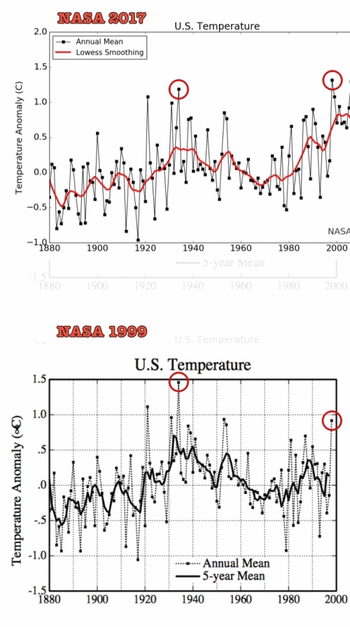
The graph with the NASA 1999 data does end at 1999, since NASA did not have any data after 1999 in 1999.
The 1999 graph shows four years hotter than 1999.
The graph with the NASA 2017 data shows that the reports can't be relied on because the historical data was changed to make it appear that 1999 and later were hotter than the earlier temperatures.
Well, let's take a look at that...
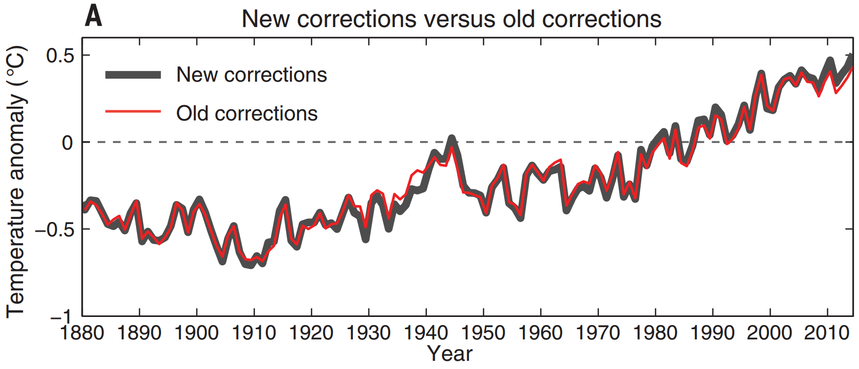
Green line is the corrected data; red is the uncorrected data. If they were doing the corrections to make it look hotter, they certainly didn't do a very good job, did they? The old data shows the same warming trend as the corrected data to a high degree of precision.
The 2017 graph shows none of the years before than 1999 were hotter, because the historical data was changed.
See above. Someone's taken advantage of your trust in them.
It is, however, a fact that the average temperatures for the last five years have been hotter than any previous global averages on record. And this in spite of a solar minimum so strong that the last time we had one like that, it was the "little ice age" in Medieval Europe.
I don't blame you for being fooled. Some unscrupulous congressmen doctored the information to make it appear that the corrected data was very different from the uncorrected data.


